What inks are used on food paper?
We print greaseproof with food-safe soy and water-based inks. They cure into the fiber rather than sitting as a film on top, so there is no coating to crack when the sheet folds.
Runs go from one color up to four. Each color is a solid Pantone match, not a four-color process build, so a red stays the same red across the whole run.
These inks are low-odor once dry. A freshly opened case smells of paper, not solvent, which matters when the sheet is touching a warm bun.
Plates are made from your file, one per color, and the ink goes down in a thin, even layer. The sheet is cut to size only after the ink is dry, so the print never smears at the edge.
White stock or kraft stock?
White greaseproof is a bleached sheet with an even, bright face. Ink sits on it exactly as you see it on screen, so a brand color prints true.
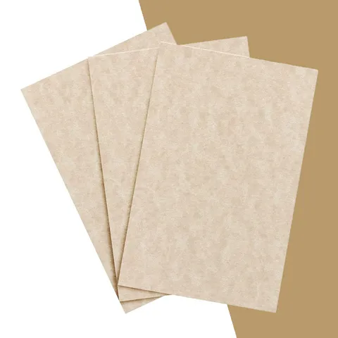
Kraft greaseproof is unbleached and runs from tan to light brown. Every ink is tinted by the sheet, so a pale blue reads gray-green and a yellow almost vanishes.
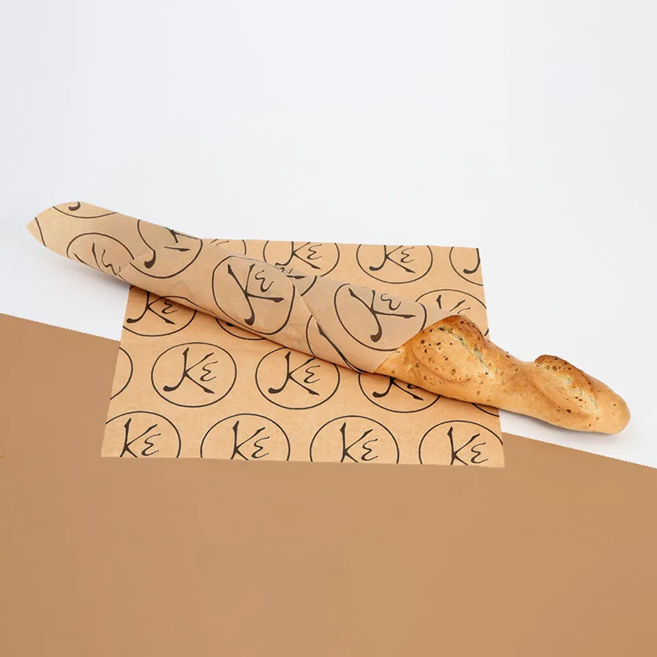
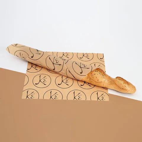
Our opinion: print one color on kraft. Black, dark brown, deep red or forest green all look right. Two colors on kraft look muddy unless both are dark. The kraft baguette sheet in our photos is a single dark mark repeated on a grid, and it reads cleanly from across a shop. The custom printed greaseproof sheets are quoted in both stocks.
How many colors should you run?
One color covers most food brands. A single-color logo registers easily and hides small misalignment in the step-and-repeat. Ask yourself what the sheet is for. A wrap seen for thirty seconds needs a logo people recognize, not a color chart.
Two colors suit a logo with a mark and a wordmark in different tones. Keep a gap between them; touching colors need tight registration and can show a hairline of white.
Three and four colors are for full brand patterns on white stock. They print well, but every extra color is another plate and another thing to check on the proof.
Single logo or step-and-repeat?
A single logo prints once per sheet, usually centered or offset toward one corner. It works when the sheet is folded a fixed way, so the logo lands on the outside every time.
Step-and-repeat tiles the logo across the whole sheet at a set spacing. However staff fold it, part of the pattern faces out.
For a burger wrap, step-and-repeat wins. A burger wrap with a repeated logo looks branded from any angle in a delivery bag. For a basket liner that lies flat, a single centered logo is cleaner.
A third option is a scatter: small icons and the brand name at random angles, like the red-on-white sheets in our wax paper photos. It hides fold lines well and suits a playful menu.
How design choices read on each stock
Use this table before you pick a stock. It saves a round of proof edits.
| Design choice | On white stock | On kraft stock |
|---|
| Pale or pastel ink | Prints true | Washes out, avoid |
|---|
| Black line logo | Crisp, high contrast | Crisp, warm look |
|---|
| Large solid fill | Even, slight matte | Slightly mottled, rustic |
|---|
| Small type | Readable at 8 pt and up | Fills in, keep to 9 pt plus |
|---|
| White ink | Not needed | Prints as a soft cream |
|---|
| Four-color pattern | Good on 35 lb and up | Not recommended |
|---|
If your brand color is light, print on white. If your brand is dark and simple, kraft gives a more natural look for the same artwork.
How to prepare your artwork file
Most delays at proof stage come from the file, not the design. Six things to do before you send it.
- Send vector artwork: AI, EPS, PDF or SVG. A JPEG of your logo will print soft at the edges.
- Convert all text to outlines so the font does not substitute on our side.
- Name each color with its Pantone solid-coated number, or tell us the closest match.
- Set line weights to 0.5 pt or heavier. Hairlines below that break up on greaseproof.
- Keep artwork at least 0.5 in from any edge. Sheets are cut after printing, and a logo on the trim line will be cropped.
- Tell us the sheet size and whether it is a single placement or a repeat, and the spacing you want.
You can also drop your logo onto a sheet in Design Your Greaseproof Paper to see placement before you send the file.
Type, lines and small details
Greaseproof is absorbent. Ink spreads a fraction into the fiber, which the trade calls dot gain. Thin strokes get thicker and small counters fill in.
Plan for it. Open up the gaps in letters, avoid thin serifs and do not reverse small type out of a solid block.
Reversed type, white letters knocked out of a dark block, is the first thing to fail. The ink creeps into the open letter and an e becomes a c. Keep reversed type to 12 pt or larger and use a bold face.
Textured stock spreads more. On a textured greaseproof sheet, treat 10 pt as the minimum for anything that has to be read.
What the proof shows and what it cannot
Before anything prints you get a free design proof. It is a PDF of your artwork placed on the sheet at size, with the repeat spacing and trim marks. Edits are unlimited, so mark up anything that looks off.
The proof shows position, spacing and color names. It cannot show how the ink sinks into kraft, or the small shift that any paper color puts on an ink.
Read it with a ruler, not just by eye. Check the logo is the size you expect on the real sheet, and that nothing you need sits in the trim margin. If something looks wrong, say so plainly, such as logo 20 percent bigger or move the repeat half an inch left. Short notes get a new proof back faster than a long email.
Color matching and what to expect
On white stock, a Pantone solid-coated match lands close enough that a customer will not see a difference between the wrap and your sign.
On kraft, every color shifts toward brown. We match the ink, not the result, so compare it against a kraft swatch rather than a white one.
Batch to batch, kraft itself varies a little in shade. A reorder six months later may sit on a slightly lighter or darker sheet, and the same ink will read a touch different. That is trade tolerance, not a misprint.
Wax and paraffin sheets print before the coating goes on, which softens colors slightly. Printed paraffin paper is a good choice when you want that muted, deli-counter look.
Mistakes to avoid and how to order
Five things that come up again and again on first orders.
- Sending a screenshot of the logo instead of the vector file.
- Choosing a pastel brand color and then ordering kraft.
- Setting a repeat so tight the logos touch when the sheet folds.
- Placing a phone number in 6 pt type that nobody can read.
- Approving the proof on a phone screen without checking size.
Send your file and sheet size through the quote form and we reply with a written quote within one business day, then a proof. Production takes 4 to 6 business days after approval. Add a photo of your current wrap if you have one, so we can match it or improve on it.